Mobile
Friendly Websites
Responsive Design
Responsive Design
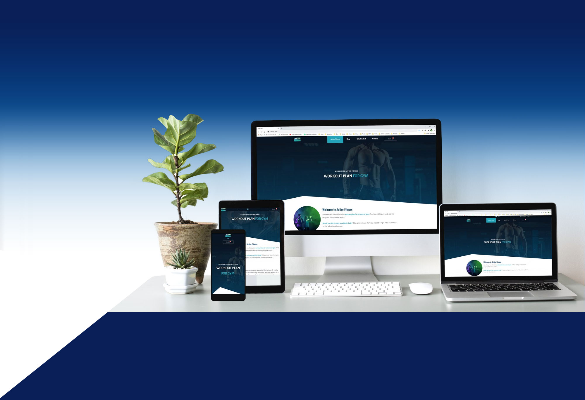
Our websites automatically detect the screen size and adjust the content accordingly to provide fully responsive and optimised sites.
The world is confronted with various devices, screen sizes and resolutions. Managing different code base for different devices and resolutions is not an efficient solution. Responsive web design provides solutions by making websites and applications smart enough to resize and adapt its content based on the screen size of the device.
With a responsive design your website will be built to resize on smaller platforms such as smartphones and tablets. For instance, if the viewer is using a smartphone, they’ll want the text to be larger and easier to read, images to shrink and the layout to be reformatted. This means the website will dynamically reformat depending on the device and it’s width.
This increases the development speed, makes project manageable and increases the usability.
Not only this but if you’re using our content management system, the entire administration section is also built to be responsive. Even updating your own website can be done on your mobile phone.
Let's create great things together